I'm not good at matching sewing projects to my furniture or anyone else's for that matter. But I still started out with fabrics that generally matched.
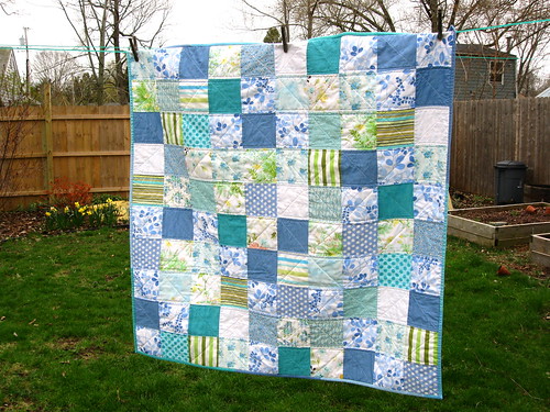
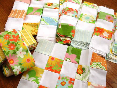
(Yes, this one is still in progress....)
But then I changed after I received my first string blocks from the green bee and added more blocks of my own. I stumbled on a new (to me) lesson in quilt design.
If I made each block out of just the Nicey Jane fabric line, then it was easy to glance at it and then move on. Once I added a few blues and greens from other lines that were just a shade or two off of a match with Nicey Jane, then it made the blocks more interesting.
I also found that the more I tried to balance out the colors within each block, the more
boring the quilt top was as a whole. Once I started grouping a bunch of lights or darks together and making each block uneven and a little "odd" to the eye, that was when the quilt top as a whole looked more
interesting to me.
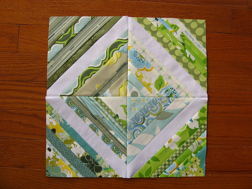
The same thing happened when I started breaking up the diagonal lines with some bits that "didn't fit." (see the top right corner block below)
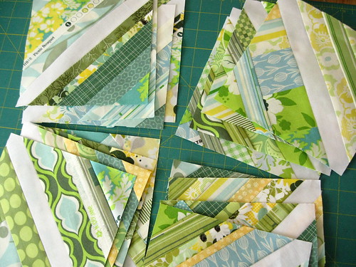
That was when the quilt seemed to come alive and my eye
felt like it needed to flit about to examine the imbalance. If my eye could find a definite pattern, then my brain would
categorize it easily and my mind wanted to move on.
I decided to take this further with contrasting colors and contrasting
fabric design styles within each Farmer's Wife Sampler block.
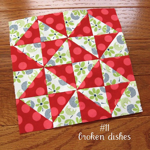
I wanted each fabric within the block to show up and then I chose a setting so each block itself could shine on its own.
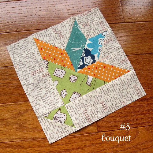
I would purposely looked for awkward combinations because sewing those fabrics together in one block could make the block more interesting.
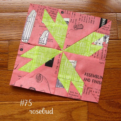
Then, with some luck, when you sew a whole slew of blocks together into a top, those may be the blocks that really shine.
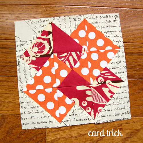
I wanted each fabric within the block to show up and then I chose a setting so each block itself could shine on its own.
I would purposely looked for awkward combinations because sewing those fabrics together in one block could make the block more interesting.
Then, with some luck, when you sew a whole slew of blocks together into a top, those may be the blocks that really shine.
And then I went one step further last year. Before, I never would have put white, cream and ivory background fabrics in the same quilt. Nor would I have used charcoal, dove grey, tan, ecru and slate together.
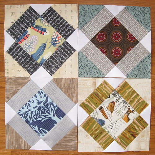
Those tones don't match per se, but they sure do make for some interesting neighbors in a quilt top. By pushing the boundaries of pretty and ugly at the same time, I think these blocks really make your mind think about what shades exist. If it was just one shade of navy, one brown and one white, it could be more easily dismissed.
I am no expert on color theory by any means. These little tidbits are things that I've just stumbled upon. Do you have any thoughts about matching or not matching? How do you work to make your quilt tops more interesting to the eye?
