I'm not good at matching sewing projects to my furniture or anyone else's for that matter. But I still started out with fabrics that generally matched.
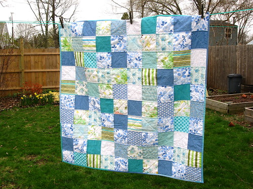
(Yes, this one is still in progress....)
But then I changed after I received my first string blocks from the green bee and added more blocks of my own. I stumbled on a new (to me) lesson in quilt design.
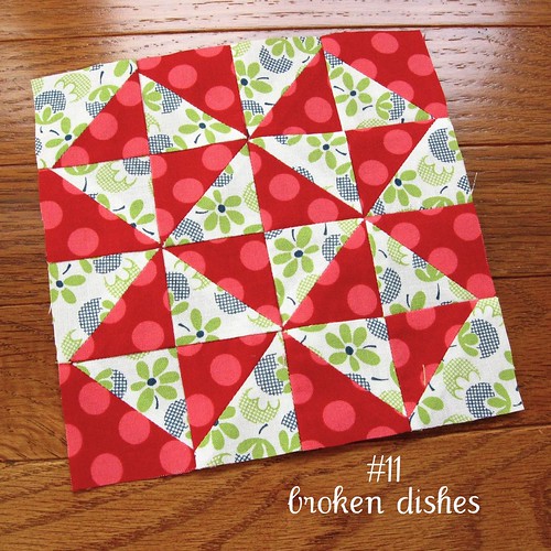
If I made each block out of just the Nicey Jane fabric line, then it was easy to glance at it and then move on. Once I added a few blues and greens from other lines that were just a shade or two off of a match with Nicey Jane, then it made the blocks more interesting.
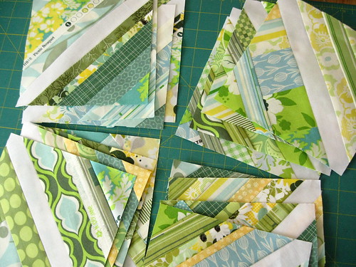
I also found that the more I tried to balance out the colors within each block, the more
boring the quilt top was as a whole. Once I started grouping a bunch of lights or darks together and making each block uneven and a little "odd" to the eye, that was when the quilt top as a whole looked more
interesting to me.
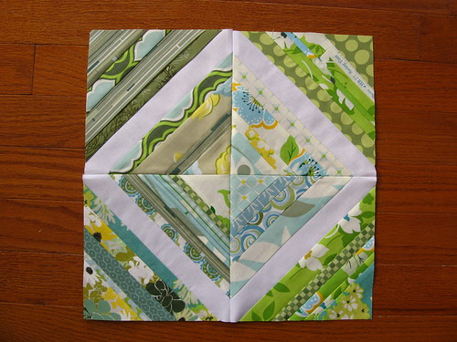
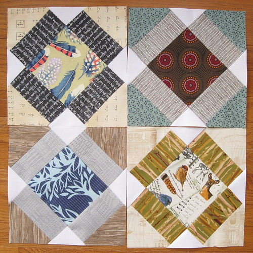
The same thing happened when I started breaking up the diagonal lines with some bits that "didn't fit." (see the top right corner block below)
That was when the quilt seemed to come alive and my eye
felt like it needed to flit about to examine the imbalance. If my eye could find a definite pattern, then my brain would
categorize it easily and my mind wanted to move on.
I decided to take this further with contrasting colors and contrasting
fabric design styles within each Farmer's Wife Sampler block.
I wanted each fabric within the block to show up and then I chose a setting so each block itself could shine on its own.
I would purposely looked for awkward combinations because sewing those fabrics together in one block could make the block more interesting.
Then, with some luck, when you sew a whole slew of blocks together into a top, those may be the blocks that really shine.
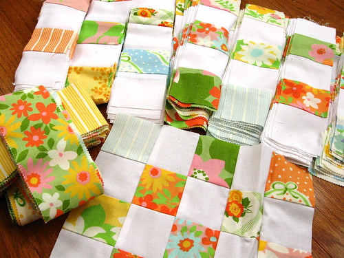
And then I went one step further last year. Before, I never would have put white, cream and ivory background fabrics in the same quilt. Nor would I have used charcoal, dove grey, tan, ecru and slate together.
Those tones don't match per se, but they sure do make for some interesting neighbors in a quilt top. By pushing the boundaries of pretty and ugly at the same time, I think these blocks really make your mind think about what shades exist. If it was just one shade of navy, one brown and one white, it could be more easily dismissed.
I am no expert on color theory by any means. These little tidbits are things that I've just stumbled upon. Do you have any thoughts about matching or not matching? How do you work to make your quilt tops more interesting to the eye?
17 comments:
I tend to choose clolours by opting some colours out and then anything but those colours goes! I don't worry about matching as I believe all colours go together, the impact (or where they clash) is in the balance of tone- so a bright pink doesn't go with a bright red, but if you use a pale pink instead, it kinda does!
By the way I love the fabrics in the last block especially- what's the one with the little deer and bird called (if you know)?
Great post (shared on my AQT fb - ok?) - anyway, I have been learning the same lessons as you. Life changing as far as our quilting goes, yes? Appreciate this thoughtful post...
Hi! Beautiful fabrics, fantastic blocks and great thoughts! You have it so right! When I pick colours, I just use my instinct - mostly. Then I use my small knowledge about painting. Before I started to quilt, my dear friend gave me good advice not to be affraid to use unexpected, 'strange' and 'opposite'colours. Something we think doesn't match, can be just the one that makes the difference. I feel quilting/patchwork is very much like painting. If there are lots of shades it's more alive.
Adding a little bit some strong, dark, light colour gives depth - shadows and light.
One funny example: my grandfather was a painter and he painted portrets about me and my sister (we were about 12 and 16 years old). My sister was very unhappy because her face was 'green' in the painting. It wasn't exactly green but there were lots of colours.
Quilting is so interesting! x Teje
Very interesting read. Thanks for sharing your thoughts on the colour choosing process you have been developing. I totally agree... To much matchy can be kinda dull!
Wow! You have some fun quilty stuff happening over there! I grew up in a matchy matchy house too and sometimes it's hard to break free of that. I love the way you explained it here. It's really fun exploring color combos, sometimes it's surprising to me what works together.
Everything looks fabulous! I love throwing in slightly off coloured fabrics.
Such great ideas in here, Melinda! I've learned that I love using a mix of white, cream, and off-white in my background fabrics. It really does make things more interesting!
I completely agree, in addition to the ideas discussed above, I like to throw in blocks that have lower contrast.
Love your post. I don't know that I'm that good with color but your block examples really sing. Something to think about...
What a wonderful subject for a post! My first love is fabric, so I'm always trying to add as many different fabrics as I can. Although I've never really thought about why something does or doesn't work, or why something is interesting as opposed to a bit boring. So well done! I think that it is about achieving balance more than having the "right match" or having something in the right place. Adding more of a dubious colour and spreading it around, will help to add that little extra something, and make it look as if it was meant to be there.
i am not a color coordinating person in my life, and my crafting just follows suit.
i do have a tendency to wear grey/black/navy clothes and so push my color boundaries when knitting, especially knitting dishcloths... i love making wild color combinations when knitting dishcloths!
and then i met crochet... oh my color palette has just exploded since i started crocheting. again, not that i put much thought into it, i just grab a bunch of brightly colored yarn and go at it :)
(but i'm still wearing a grey shirt today... heh heh, baby steps of color...)
-melissa
I (now) tend to agree with you and lean towards the not matching. It's fun and challenging. And surprising and not boring.
I think I'm a natural matchy-match and so growing up I would complain to my mother at how some quilt blocks didn't go together in some of our quilts. She kindly pointed out to me that well maybe those "ugly" combos brought out the pretty combos.
Watching you learn this and blog about this has caused me to reconsider my matchy ways and try to challenge myself to surprise the viewer. Plus, I like to "make do".
Watch my Dolly Dress Up quilt. I ran out of a matchy matchy fabric and now have to make do. So I will not be matchy matchy per say. :)
Melinda, you have caught on to a really important color selection tool. Matching colors tones and values too carefully is a bore in the end and anytime you have unexpected passages of colors they speak of true color as it is in our world. I remember trying to sort out the color of light hitting leaves in a huge tree on my way home from color class and I was studying it so carefully while walking across campus I ran smack into another tree trunk and nearly fell down. Color and Light was my favorite class in college but we had to learn almost everything the way you describe it in your great post. Trial and error is the best teacher of all.
Interesting post Melinda! I did not grow up in a matchy world. I was often so embarrassed that I was determined to have matching things when I grew up. I thought matching was what would make me seem more grown up. I've realized that isn't the case. As far as quilting goes, I think it is a very interesting thing. Something to make you think about while creating something. Mostly, my small stash mandates the colors I use. I realize it isn't always the most interesting, that is the reality. I really appreciate you typing this all out. What I'd really like to know, is how you chose your fabrics for your stash. What makes you purchase one fabric over another? I'm trying to be very thoughtful about future purchases. They are very limited and I want to make them work and not dread them down the road.
I loved reading this Melinda! I definitely subscribe to what you've been saying- I usually find it very hard to use more than a few fabrics from any one collection together in a quilt. One of the first quilt books I ever owned was Jinny Beyer's Color Confidence for Quilters (I put it on my Christmas list the year I was 20!)In the book she talks about how important it is to have a range of each color- some bright, some duller, some tending toward one side of the spectrum or the other. I'm sure that has shaped my thinking ever since. The book came with 150 little paper "fabric swatches" that you could arrange to help you understand the concepts in the book. Oh how I loved those little swatches! I had no stash at all at the time, so no fabrics to play with. But rearranging my little swatches gave me endless entertainment!
This was a very thought-inducing post ... and I agree with your observations, too. :)
I'm going to share it on my shop's FB page. Hope it ups your visitors.
:) Linda
First, I must admit I didn't read all of the comments, so I apologize if I repeat something.
I have a tendency to look at the really matchy quilts, think they are boring and move on. Sometimes this can be livened up by quilting, sometimes no amount of quilting will improve boring fabric choices, or the quilting itself is just as boring. True, not everyone will agree with this. I embrace that, because I want people to like different things. If everyone liked what I liked the world would be a pretty boring place.
I have a special love of scrap quilts. Quilts made with very little planning. Sure, I may think about what strip to stitch next onto a string block, or I may just grab the next strip in the pile. When making crumb blocks I go by size and rarely care what the colors or prints are. I just want to use up the fabric.
I think scrap quilts are great in so many ways. One of those ways is that I can point to the different fabrics and remember what quilt the bulk of that fabric went into. Or the person I gave it to. Or the person I helped with the construction. I love those stories and I think they really add to the finished piece. Quilts can tell so many stories if you just let them.
Post a Comment
You are awesome! Thanks for leaving a comment :)