And sometimes I can't help myself.
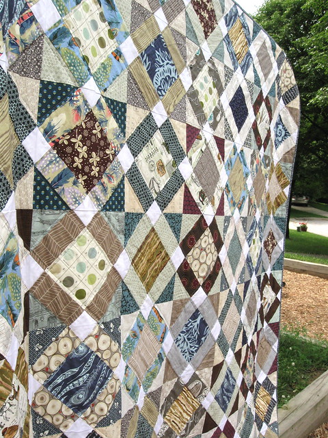
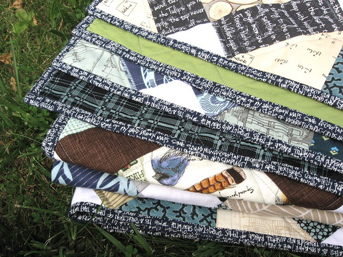
When I make a quilt, I strive to mix fabrics in a way that makes each block and then the quilt as a whole...sparkle. That sounds terribly girly and immodest. Maybe shine is a better word. I want each block to get its own time with the eye. I want the finished quilt to make your eyes move around the entire thing. The human brain is fickle and impatient and makes snap judgements. Some quilts can easily be summed up by the brain as two or three colors/shades--one pattern--symmetry--light--dark--okay, I get it--I'm moving on to look at something else.
I want my quilts to make the brain do a double take. What?--I don't get it--Why would you add that color, too?-And what is with that pattern next to that one?--And how many freakin' shades of one color do you really think you can get away with here?
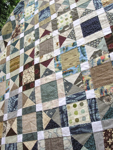
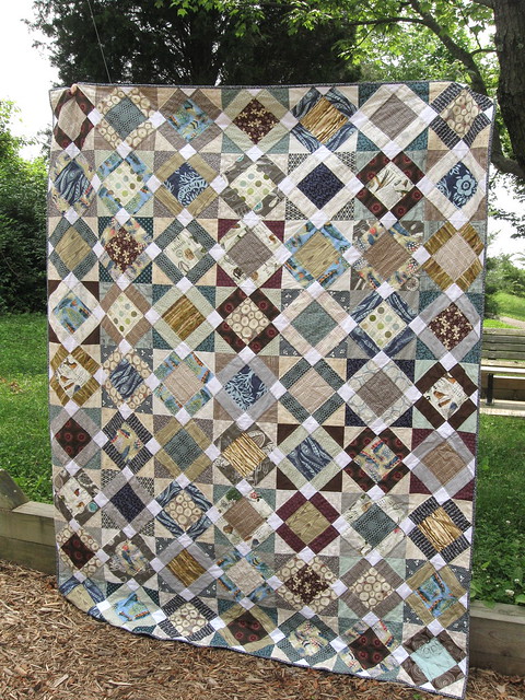
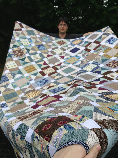
I can't really judge if I achieved that here. I'm still too close to it. I can tell you that I am not a good enough photographer nor do I have a good enough camera to truly capture the colors and the values in this quilt.
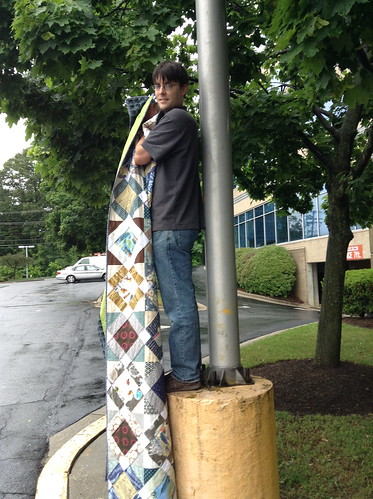
And this is the second best. See? Annoyed...by holding up his own darned quilt.
I guess I am a pain in the butt with the camera.
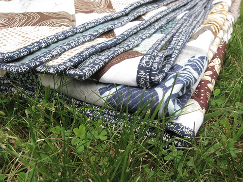
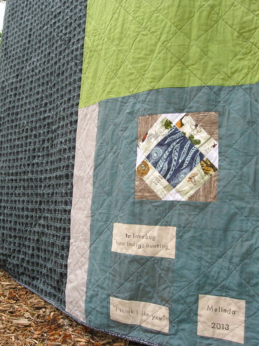
Oh well, here is the back. I used one of my favorite DS Quilts manly prints on the left, a green IKEA sheet on the right and some ash gray solid and KF shot cotton.
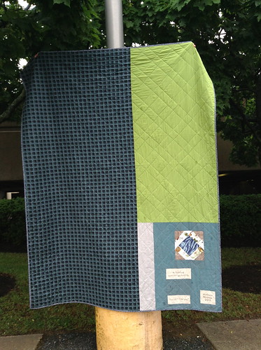
The labels are kind of schmoopy. "to lovebug from indigo bunting" comes from the inscriptions on the inside of our wedding bands. I think it is healthy to remember the old nicknames as we are married longer. It softens the annoyed looks and bossy lady moments. "I think I like you" is the name of the quilt and I blurred out our last name on the final label.
Martha Negley, Farmington, Feathers, Twig Branches, Tree Rings
Anna Maria Horner, Innocent Crush, Bubble Burst and Woodcut
Anna Maria Horner, Field Study, Fine Feathered
Carolyn Friedlander, Achitextures, Ledger, Blueprint and Scribble Notes
Denyse Schmidt, Hope Valley, Prairie Rose, Diamond Dandy and Cactus Calico
3 Sisters, Etchings, Antique Architecture
Erin Michaels, Lush, Wood grain and Painter's Palette
Parson Gray, Curious Nature, Starcomb
DS Quilts, Richmond, Plaid and Tiny Berry
Sweetwater, Hometown, Small Text and Marketplace Floral
Timeless Treasures, Sketch Basics
Joel Dewberry, Modern Meadow, Herringbone
Suzuko Koseki, Kitchen and Arts Crafts prints
Melissa Averinos, Dazzle, Basketweave
Violet Craft, Madrona Road, Memoir
Art Gallery Oval Elements
Sarah Watts, Timber and Leaf, Tree Rings
Cori Dantini, Beauty is You, Tiny Seeds
Dear Stella Honeycrisp

If you made it all the way to the end of this post, thank you for your patience. I think you can tell that I'm happy with how this one turned out.
I hope your sewing projects shine, too.
29 comments:
It's fantastic. I think you succeeded completely with this one. Hope he likes and appreciates it!
Know exactly where you're coming from - and very eloquently expressed! Terrific example of quilty sparkle.
This quilt definitely sparkles Melinda, it's a real treasure! I'm sure it looks even better in person too, it's so hard to capture a quilt in a photograph! :)
It surely does shine, Melinda! You can really tell from the close-up photo (the one with your hand in it?) that you have used some amazing fabrics in a beautiful range of colours!
Yes, the colors were the first thing I noticed in the photo. There's a lot going on here, but in a way that really works. What's especially interesting to me is that a lot of the colors are what I'd think of as more "subdued," but the quilt as a whole definitely isn't. Love it!
Lovely neutral colours, it gives my eyes a nice break from the usual rainbow quilts!
I can't get over the fabric and color choices on this quilt! You really did make it "sparkle"... what an amazing quilt!
I think you did a great job of making it sparkle. It really is fabulous.
No need to be modest about this one--it is a beauty! I absolutely LOVE the colors that you chose and I know I have more than a few of these same fabrics that I need to pull out and put to good use. You have definitely inspired me with this one!
Tricia
I think it's fabulous. Kepp on quilting
Carol W
I love it! Front and back.
This quilt is so fantastic! And I love the way you explained your process. I love when quilts can be gazed at for years without being figured out. I remember looking at my quilts on my bed growing up and feeling this way.
You did such a great job. And the pictures are great too.
I love your fabric choices, I'm obsessed!
Is the pattern yours? Is it for sale?
Love this!
Oh man, that is just too impressive. Even though you've shown it at different stages, the finished quilt is worth trumpeting. Well done!
This quilt is so fun! The colors are great. Can you tell me the name of the fabric you used on the binding?
Thank you for your comments Tricia, Carol W and MCA.
Lydia, the pattern is a free tutorial from Leila at Where the Orchids Grow. I linked to the pattern in some previous posts about this quilt, but you could do an internet search for Boy's Nonsense tutorial and Where the Orchids Grow.
ljeanne, the binding fabric is from Caroyln Friedlander's line Architextures and is called Scribble Notes.
best man quilt ever!! Fun photos too!
I think you totally achieved what you wanted. And I always would rather see too many than too few pics. The quilt is beautiful! And I have many sore arm husband outtakes too.
I have been admiring your work on this quilt as it has come together and it's really beautiful. Love the play with values and wonderful prints.
It's gorgeous! And I loved seeing all the photos.
It's beautiful
this is lovely! A true manly quilt can be quite difficult to accomplish and I think you've done it. I would love to try this pattern one day.
Well I'm glad you posted so many pics of this one Melinda. It's a real beauty! I really love it. Perfect man quilt. Makes me want to play around with all that value stuff too :)
it really is just so spectacular melinda.
Very fun.... thanks for sharing, bossy lady.
You don't want to know our nickname's!
... and I have only collected fabric for his quilt. He's threatened to make it himself...
And that's why I sensor myself from sharing his nickname! ....
i love everything about this quilt! perfection!!
-melissa
Melinda, I love this quilt! Please don't be shy, I want lots of photos of fantastic quilts! Sorry but a post with one photo is so boring.
You have the talent as a painter to use lots of colours, shades, prints, shapes, light and shadow to make the 'picture' alive! I really like this pattern, too! x Teje
Post a Comment
You are awesome! Thanks for leaving a comment :)